Hic Sunt Dracones
Is Greenland Bigger than Africa or Australia?

How big is Greenland?
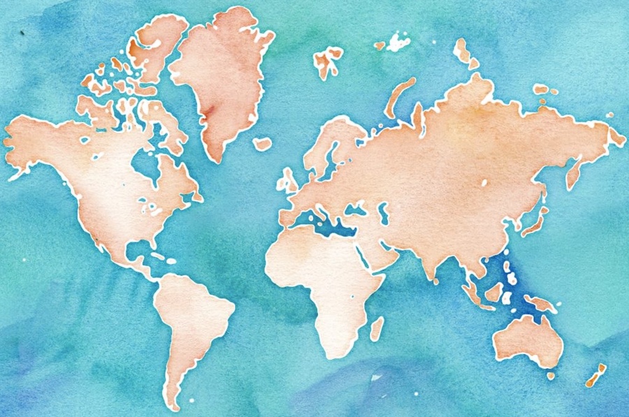
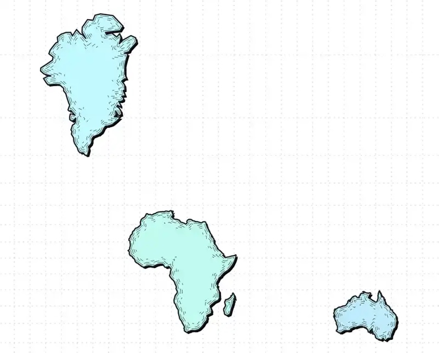
Greenland and Africa look similar in size on most online maps. Which raises an intriguing question: Is Greenland bigger than Africa or Australia?
The answer to anyone with a globe is straightforward: of course not!
Why, then, does it appear that way?
To illustrate this, we must explain how cartographers represent the Earth.
The Earth is round, and maps are not—they are flat. The problem of projecting a three-dimensional spherical Earth onto a two-dimensional flat surface is ancient. Early cartographers tried to find the best way to solve this problem. The solution is to use complex mathematical transformations called map projections.
The Mercator Projection

Historically, the Mercator projection was among the most popular, especially for nautical maps. Sailors used this projection for navigational purposes, particularly when exploring the New World and crossing oceans. The principal characteristic of the Mercator projection is that it represents lines of the same course as straight segments and conserves the angles with meridians.
The Mercator projection preserves the same angles on a plain 2D map as on the curved Earth.
When Google introduced Google Maps, they used the Spherical Mercator projection for their maps, also known as the Web Mercator projection. Later, other web services adopted that projection, namely OpenStreetMap, Bing Maps, Here Maps, and MapQuest. The rest is history.
But why did Google pick the Web Mercator projection?
Web Mercator was well-suited for world web maps because we can zoom seamlessly into a local or large-scale area with relatively little distortion. Thanks to Mercator, two perpendicular streets will always appear perpendicular at the city level. However, one of the downsides is that it distorts and exaggerates the size of regions closer to the poles; hence it is common to crop Antarctica off the map. This practice results in the Northern Hemisphere appearing much larger than it is.
The Greenland Problem
It is a known nuisance, and cartographers call it “The Greenland Problem.”

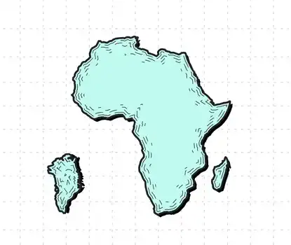
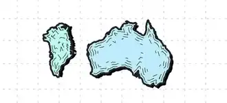
On the Web Mercator map, Greenland appears to be the same size as Africa or Australia, yet, in the real world, Africa’s land area is fourteen times larger.
To experience this phenomenon, you can play The Mercator Puzzle or check The True Size application.
Both websites offer an excellent way to visualize the distortions inherent in the Mercator projection through fun games and interactions. You can drag the different countries to see how dramatically larger or smaller they become as you move them closer and further away from the equator.

Remember, Greenland is smaller than Africa and Australia—despite Google maps suggesting otherwise.